After having explored this huge dataset, I wanted to explore with more of time-series components to understand the distribution much better. So, lets dive in.
- For Initial Data Exploration of this data, please read here - PART-I
EDA – TIME SERIES
TIME SERIES
- After exploring products, prices, stores and states, lets explore how those variables will span across the time.
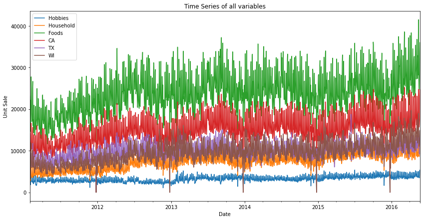
- The above images shows us the time variation of three states and three products.
- A detailed visual of the products time-series across the three states. The drop to zero in the above plots is on Christmas Day as the stores are closed. The spikes of foods are on SNAP days in the respective states.
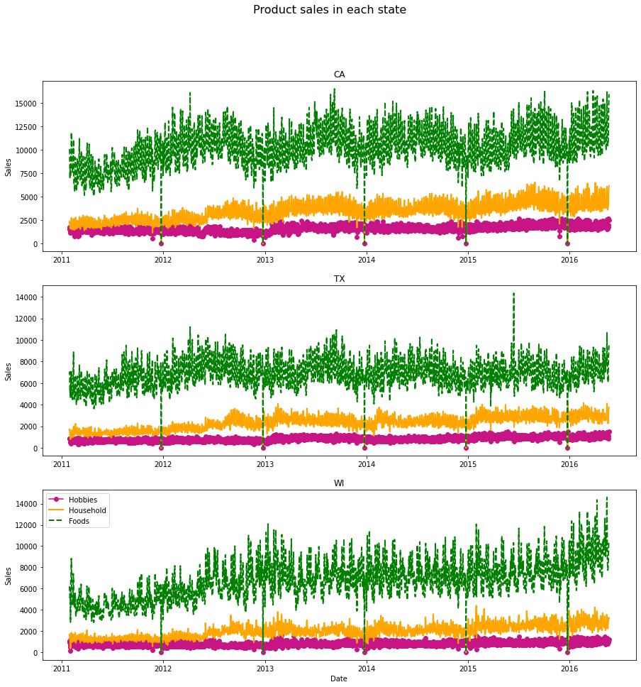
TOTAL PRODUCT SALES IN EACH STATE
- A time-series visual, plotting the demand for all products in each state. WI and TX appear to be having similar demand as the year progresses to 2016 whereas, CA has been consistent with small increments over the years.
- We can also see occasional spikes, highest in a year, and nill at the end of the year. This might be due to some states having SNAP days or other festival events. The nill demand is due to the closure of marts on Christmas days.
You can toggle over the graph and select any area by drawing on the visual above and get more insights.
PRODUCT SALES IN ALL STATES
- Now let us see another time series visual. Here we are plotting the demand of products combined across all three states. As said in the previous post, we infer that the food product categories having been selling higher, then comes the household products and hobbies products respectively. We can easily infer this as people need more food products than compared to household and hobbies products. As mentioned earlier, we see occasional spikes, highest in a year especially in foods and not much in other products and nill at the end of the year. This is due to some states having SNAP days or other festival events. The nill demand is due to the closure of marts on Christmas days.
UNIT SALES IN EACH STATES
A more in-depth visual confering all the points we have discussed in the above inferences.
SEASONLITY DISTRIBUTION
YEARLY DISTRIBUTION OF PRODUCT SALES
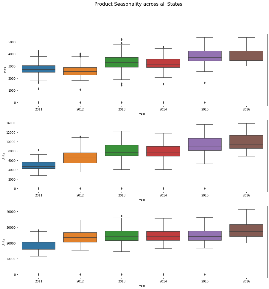
- The above plot shows the sale/demand of all products combined in all states across the years. We can infer that the CA state doesn’t see year on year increase, whereas the Texas states does see year on year increase. Wisconsin state appears to stable demand across the years but increase more than usual in the last year. But above 2016, we have data only first 6 months approximately.
MONTHLY DISTRIBUTION OF PRODUCT SALES
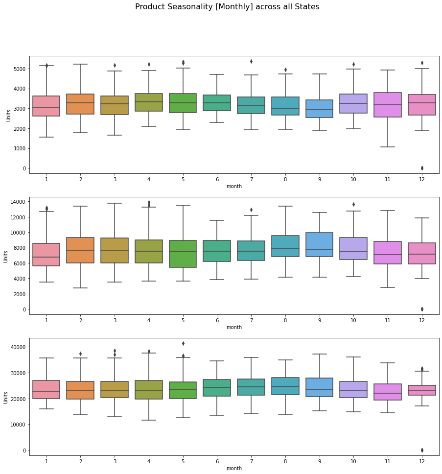
- The above plot shows the sale/demand of all products combined in all states in all years combined across the months. This is a monthly seasonality distribution. It appears to be there are fair amount of outliers but a consistent demand of all products across the states can be seen. Some states have more median per month and constant average but some months show the variance of median is higher in some months especially in TEXAS states. January and Decemeber, June and July seems to have similar demand across the states.
UNIT SALES EACH PRODUCTS MONTHLY
- Here, I try to plot a monthly demand visual of the products across the three states separately. California and Texas food products have seen a fairly consistent increase but not a complete upward trend across the years, whereas Wisconsin has a more upward trend. This confers that we have to look into individual food product item_ids to have a clear understanding. Household and hobbies appeared to be having a similar trend across all three states. The state with a higher population will be having higher demand/sales compared to others.
WEEKLY DISTRIBUTION OF PRODUCT SALES
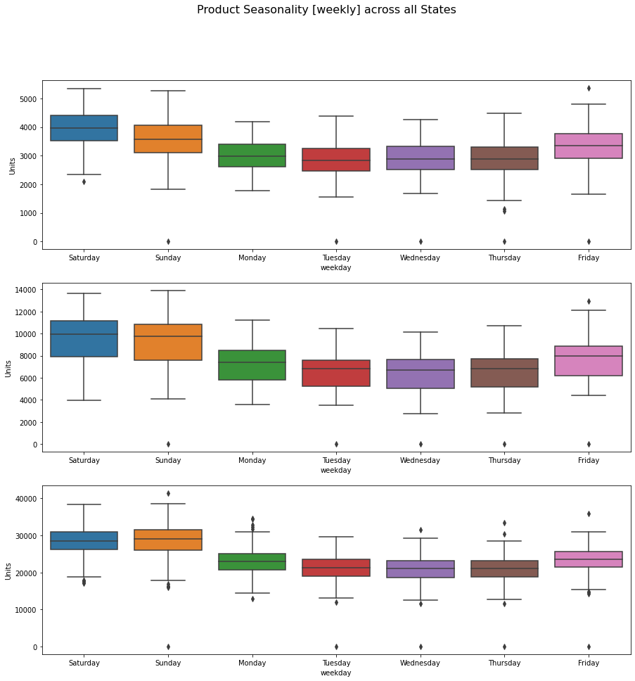
- From the above plot, we can see that the demand for products is more on weekends ocmpared to weekdays. But Weekdays do also have some outliers but that may be due to SNAP Days.
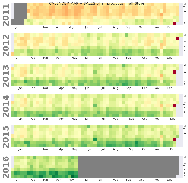
CALENDER MAPS
Sales of all products of all states across plotted yearly. The red dots confer the same point I made earlier, stores closed and zero sales. The darker the green higher the sales.
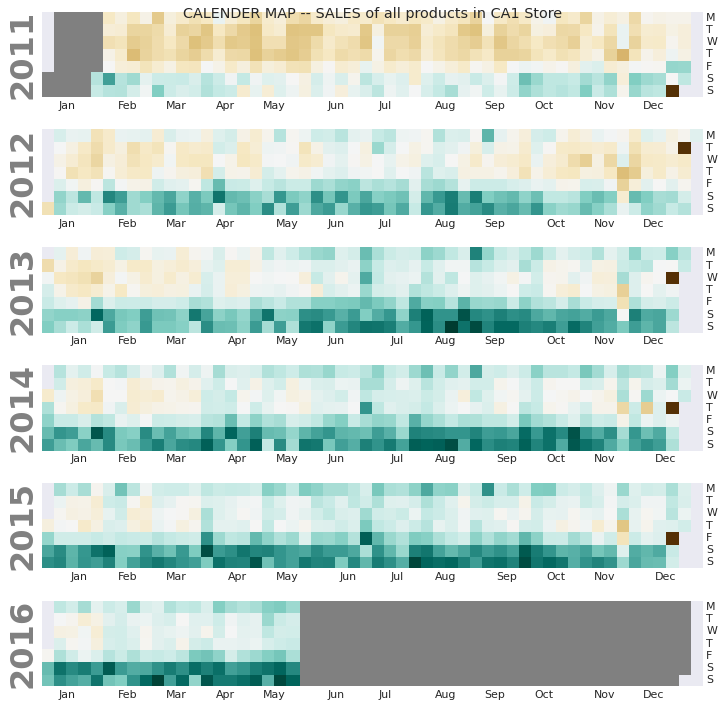
This plot is for total products sold in one store CA_1.
With this, I have gained a fair amount of idea, how this data is distributed across products, year, states, stores. Now time has come to move on modelling and try the forecasting methods.
Thanks for the read. In the next post I will be training a model and make prediction forecast for the 9 time-series models I selected. – READ IT HERE